Boxplots
Another way to look at the distribution of a variable is using a boxplot. A boxplot makes use of the standard five-number summary, that is
- the minimum value;
- the first quartile or 25th percentile;
- the median (or 2nd quartile / 50th percentile);
- the third quartile or 75th percentile; and
- the maximum value.
Keeping with the hourly temperature data, the five-number summary can be obtained in R using the following command:
##    Min. 1st Qu.  Median    Mean 3rd Qu.    Max.    NA's
##   10.94   39.92   55.40   55.26   69.98  100.04       1
This provides us with the five-number summary, as well as the mean hourly temperature. There is one missing value in the hourly temperature data, which is represented in R by NA.
median and mean values say about the distribution of a variable?
The boxplot of the hourly temperature data is plotted below.
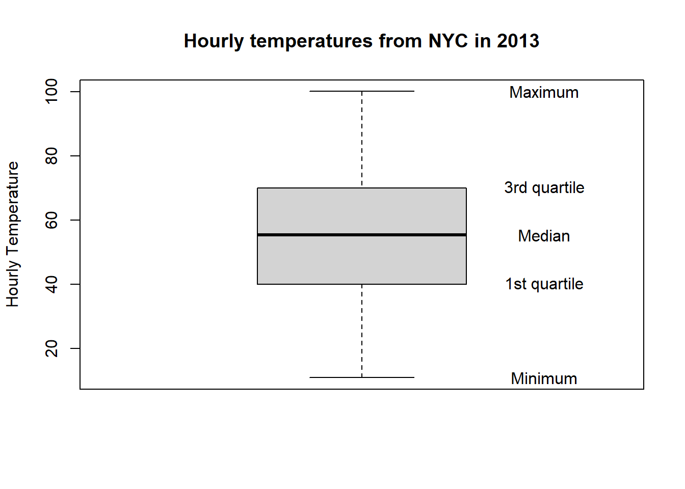
Figure 10: Figure 12: Boxplot of hourly temperature recordings from NYC in 2013.
The elements of the boxplot relating to the five-number summary have also been labelled. Other features of the boxplot are:
- the interquartile range (IQR), that is, the height of the box (3rd - 1st quartiles), and is a measure of the spread of the middle 50% of values. Longer boxes are indicative of greater variability.
- The dashed lines are known as whiskers and represent values less than the 25th percentile, and greater than the 75th percentile, respectively. The longer the whiskers, the more variability there is outside of the middle 50%.
Boxplots are useful visualisations when comparing the distribution of a numerical variable split across groups (or a categorical variable). For example, we could look at how the hourly temperature changes by month, where month is our categorical, or grouping, variable.
To create boxplots using ggplot we use the geom_boxplot function. If we want to look at boxplots of a variable separately for a categorical variable then we need to introduce the factor function. This converts a numerical variable into a categorical one, essentially creating labels or categories from the numeric values. For example, the month variable within the weather data set is a numerical variable taking on the values 1,\(\ldots\),12, for each month. However, it makes more sense to convert this into a categorical variable using the factor function, such that:
## [1] 1 1 1 1 1 1 1 1 1 1becomes
##  [1] 1 1 1 1 1 1 1 1 1 1
## Levels: 1 2 3 4 5 6 7 8 9 10 11 12
with levels, or categories, 1,\(\ldots\),12 for each month. Hence, the boxplots can be produced using ggplot as follows:
ggplot(data = weather, mapping = aes(x = factor(month), y = temp)) +
  geom_boxplot(fill = "steelblue") +
  labs(x = "Month", y = "Temperature (Hourly)",
       title = "Hourly temperatures from NYC in 2013 by month")  +
  scale_x_discrete(labels = c("Jan", "Feb", "Mar", "Apr", "May", "Jun",
                              "Jul", "Aug", "Sep", "Oct", "Nov", "Dec"))
Figure 11: Figure 13: Boxplots of hourly temperature recordings from NYC in 2013 by month.
Note, we have introduced a new function scale_x_discrete, which is used to rename the labels of the boxplots. This function is used as our categorical variables are discrete in nature.
After splitting the hourly temperatures by month, we now see points extending beyond the whiskers of the boxplots. These are known as outliers, and may be thought of as unusually small or large values. However, the definition of an outlier here is somewhat arbitrary as they are defined by the length of the whiskers, which are no more than 1.5 x IQR.
Remember that the horizontal line within the boxplot is the median value.
Remember that the box of the boxplot contains the middle 50% of data, and as such the larger the box, the more spread or variability within the middle 50% of values.