Linegraphs
Linegraphs are typically used when looking at time series data, that is, when we have information on how a variable changes over time. Hence, there is a natural ordering to the data when observing how something changes over time, and therefore, linegraphs should be avoided if there is no sequential ordering of a variable. Let's again look at the hourly temperature data, but this time only for Newark International Airport in January. This can be done by first subsetting the data as follows:
Task: Get a feel for what is contained in the new data set for hourly temperatures at Newark International Airport in January using functions mentioned earlier.
Try using the head and dim functions.
## # A tibble: 6 × 15
##   origin  year month   day  hour  temp  dewp humid wind_dir wind_speed wind_gust
##   <chr>  <int> <int> <int> <int> <dbl> <dbl> <dbl>    <dbl>      <dbl>     <dbl>
## 1 EWR     2013     1     1     1  39.0  26.1  59.4      270      10.4         NA
## 2 EWR     2013     1     1     2  39.0  27.0  61.6      250       8.06        NA
## 3 EWR     2013     1     1     3  39.0  28.0  64.4      240      11.5         NA
## 4 EWR     2013     1     1     4  39.9  28.0  62.2      250      12.7         NA
## 5 EWR     2013     1     1     5  39.0  28.0  64.4      260      12.7         NA
## 6 EWR     2013     1     1     6  37.9  28.0  67.2      240      11.5         NA
## # ℹ 4 more variables: precip <dbl>, pressure <dbl>, visib <dbl>,
## # time_hour <dttm>## [1] 742 15To produce linegraphs using ggplot we use the geom_line function. Hence, our linegraph for the hourly temperatures at Newark International Airport in January 2013 can be created as follows:
ggplot(data = Newark.Jan, mapping = aes(x = time_hour, y = temp)) +
  geom_line() +
    labs(x = "Time (Hours)", y = "Temperature",
title = "Hourly Temperature at Newark Airport in January 2013") 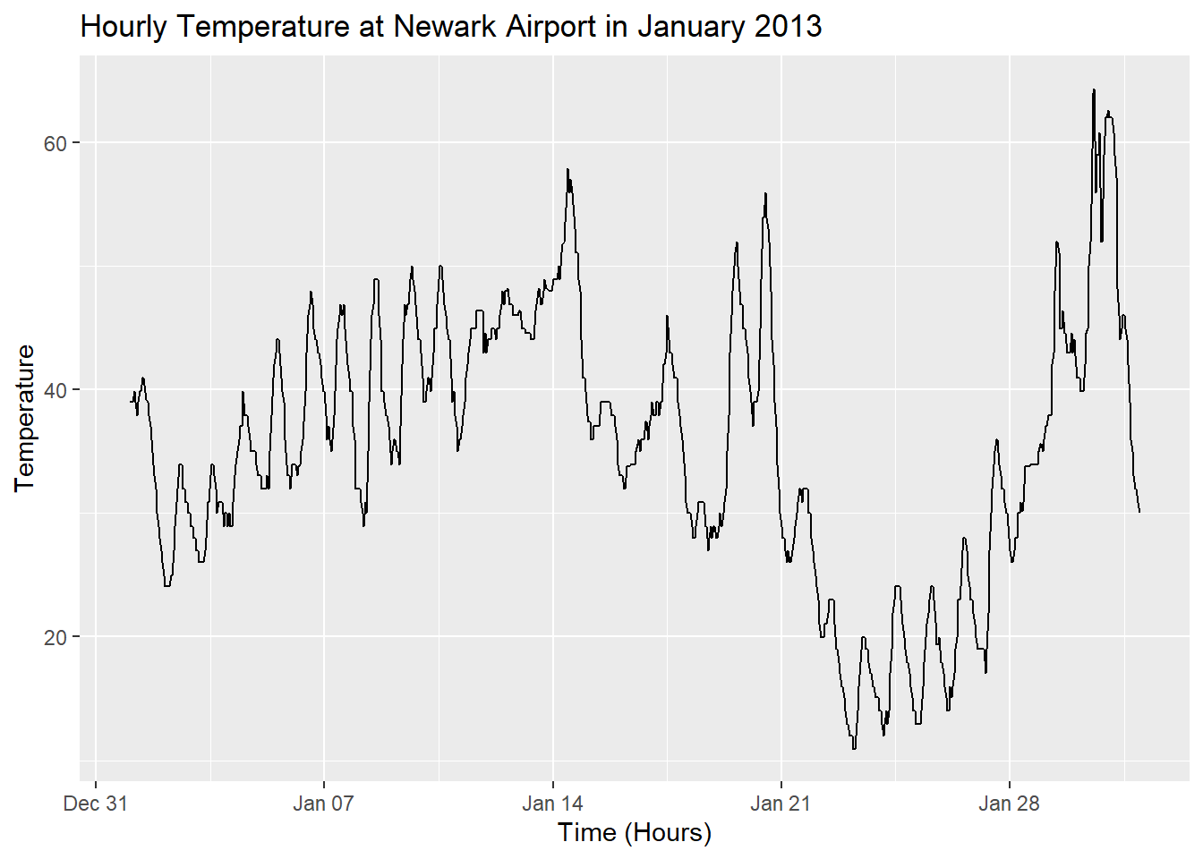
Figure 16: Figure 18: Hourly temperature at Newark Airport in January 2013.
Before moving on to the next section, consider the following:
- In the code for the linegraph above, why has
time_hourbeen plotted on the x-axis and nothour? - Why should linegraphs be avoided when there is no sequential ordering of the data?
- Why are linegraphs used when time is the explanatory variable?
- Describe the trend in hourly temperature at Newark International Airport in January 2013.